Where Does Wealth Really “Come From”?
Short answer: Lending, government deficits, capital formation, and holding gains
I ended my last post with an apparent conundrum: “One person’s spending is another person’s income.” It seems to imply that spending and income must be equal. And since saving equals income minus spending, saving must be…zero? That’s obviously not the case.
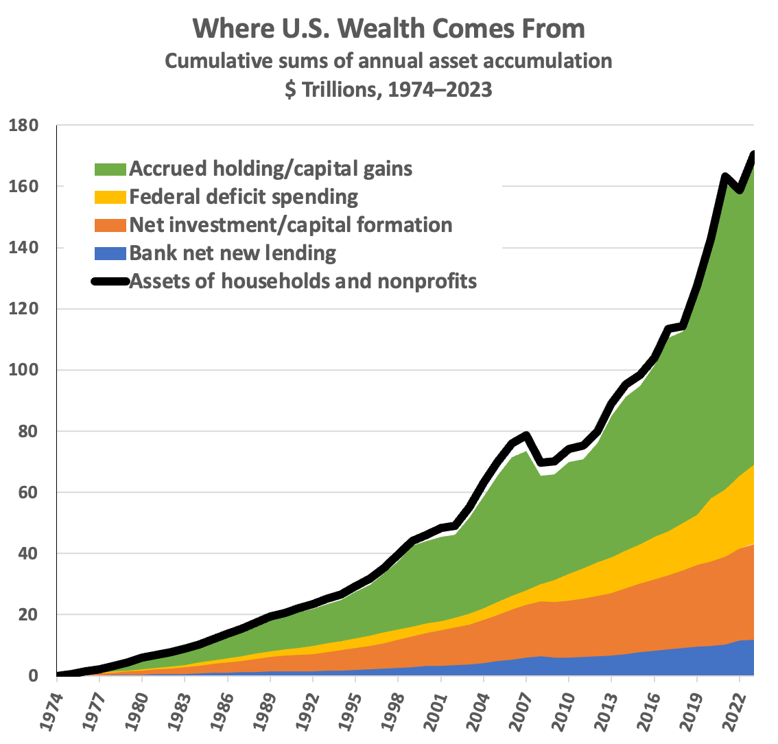
As I pointed out, other people’s spending is not the only source of our income. I listed four mechanisms that create new assets and expand our collective stock of wealth, and promised that I’d explain them in my next post. Here are those four mechanisms. (Ignoring liabilities and net worth for the moment; just focusing here on the assets for simplicity and clarity.)
Bank lending. When you borrow, the banks create new money-assets out of thin air, and add them to your bank account. Both you and we, collectively, have more assets. (You also incur a liability; you gotta pay the loan back. So borrowing doesn’t change your or our net worth.)
Federal deficit spending. The government creates new assets, also out of thin air,1 and deposits them in private accounts for either spending or transfers. And it doesn’t tax them back. Hence the government deficit. (Treasury constantly issues new bonds and swaps them for the bank deposits — which vanish — but that has no effect on the total assets created; it just changes the type of assets held by the private sector.)
Net investment or “capital formation.” When you pay someone to create long-lived goods that you then own — like a house — you post the value of that new house to your assets. Again, we collectively have more assets.
Holding gains. Asset prices go up — mostly real estate and equities. All the asset holders see those price increases and “mark their assets to market.” (Either your brokerage does this for you instant by instant, or you look at the new higher Zestimate of your home value online.) There are more assets. And no, gains aren’t just fluctuations up and down. Look at the green area in the graph below; we’re talking $103 trillion dollars in asset accumulation from those gains since 1974 — with only one significant (and brief) drawdown, in 2008.
Right off, notice that those four asset-creation mechanisms pretty perfectly explain the growth in total assets.2 There are small discrepancies of course; national accounting isn’t perfect. But the story’s pretty clear. (The data series are here.)
Yeah, but who gets the assets?
This a different question, with different mechanisms involved. How do households capture shares of the new assets, the ever-increasing pie? The answer starts by looking at income sources, but at income writ large: including asset-holder’s total return on owned assets, which includes holding gains accrued and accumulated over years, decades, lifetimes, generations, and dynasties.3 Holding gains don’t “flow from” anywhere; they just appear when people see higher asset prices and “mark their assets to market” (as brokerages do for their customers, constantly and instantaneously).
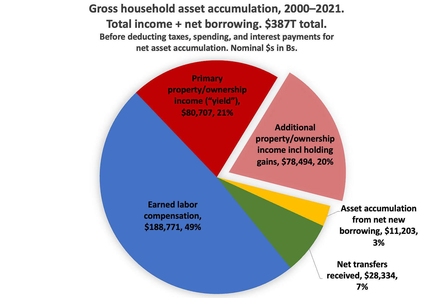
Households receive income, assets, in three ways: for doing things, for owning things, and from (mostly government) transfers. Here’s how those shares break out (including new borrowing, for a complete picture), just showing 22 years for illustration.
Here’s how that income accumulated over the years (putting aside borrowing to just show income).
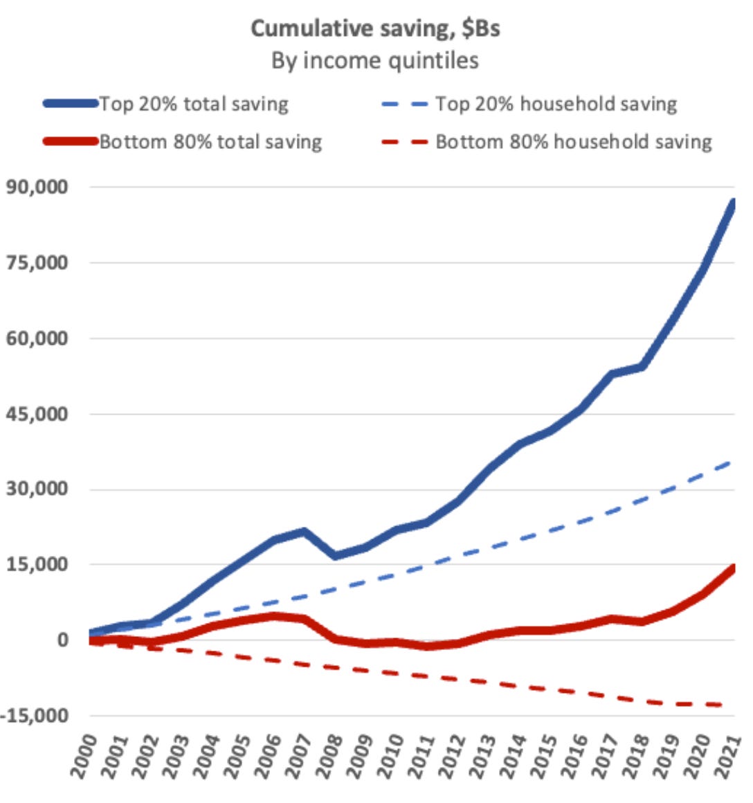
The total here is much bigger than the “assets created” number above, because the bulk of income is from existing assets circulating in spending, not being created. There’s no straight accounting line from assets created to household income sources. But we can get a sense of it if we subtract taxes and spending to look at (total) saving, net asset accumulation. Here’s that, broken out by income classes. (Total saving includes holding gains, and equals wealth accumulation; household saving doesn’t.)
Because the top 20% owns most of the assets and so gets most of the return on assets, it captures 85% of the total saving in this picture, of the asset-pie increases — which ultimately come from the four asset-creation mechanisms described above.
And that total-saving differential completely explains the increasing wealth share of the top 20%.
Comments and questions are most welcome, as always.
To paraphrase Milton Friedman, both banks and governments have both printing presses and furnaces.
Note that household wealth, as on balance-sheet Table B.101 (households and nonprofits) is the only measure we’ve got of national wealth, because ultimately the household sector owns everything; the accounting-ownership buck stops at households. This is because households own shares in firms, but since 1865, firms can’t own shares in households — people. And households also ultimately “own” government (though you can’t tally government “value” with accounting, for reasons I won’t explain here). The Fed also offers an alternative Table B.1, “Derivation of U.S. Net Wealth” (whatever “net wealth” means), which is kind of a Frankenstein-monster construction. It tries to tally “real” nonfinancial assets by sector, but for the firms and rest-of-world sectors, it…punts, tallying outstanding equity shares at current market prices. The B.1’s slightly smaller wealth total basically just equals household wealth minus the U.S. Net International Investment Position (NIIP).
Measures of “personal” income, “household” income, and “national” income ignore holding gains, even while holding gains comprise ~50% of households’ total property income, total return on assets.


“let them buy houses” is todays “let them eat cake”?
Capital gains reaped by the seller and paid for by the buyer … redistribution of wealth between generations?