

Which of Piketty’s “Rich Get Richer” Theories Matters More?
Two explanations for The Matthew Effect

For to every one who has will more be given, and he will have abundance; but from him who has not, even what he has will be taken away. —Matthew 25:29, Revised Standard Version
Steve Randy Waldman reminded me recently of this great 2014 Matt Bruenig post from Demos. (The post is missing on the Demos site; the link here is from archive.org.) It unpacks some fairly abstruse reasoning in Piketty’s Capital in short, clear, simple form.
Piketty actually has two theories for The Matthew Effect: why the rich get richer. Since Piketty uses “capital” and “wealth” as synonyms,1 I use wealth here (or more precisely, assets) as the key term. The two theories:
Wealth grows faster than GPD/GDI. Since wealth holdings deliver “property” income to the wealthholders, over time the share of national income captured by asset-holders in return for owning stuff increases, vs. the income captured by workers in earned labor compensation, for working.
Wealth (assets) concentrate into fewer hands. So, the unearned property income received by assetholders is more concentrated as well, in a self-perpetuating cycle where more-concentrated wealth delivers more-concentrated (property) income and vice versa.
One or both of these is very clearly at play in the U.S., and over a very long period:

The red line is the standard-issue measure; the denominator (household income) is the NIPAs’ radically balance-sheet-incomplete measure of household income.2 The blue line divides labor income by households’ total income including total return on assets, which necessarily includes the “capital” or “holding” gains accrued and accumulated by people, households, families, and dynasties over years, decades, generations, and…dynasties.
But which of the two theories most powerfully explains the big labor-share decline, and hence the runup in the property-income share? For the moment I’ll just share two quick graphs. (This topic merits deeper drill-down; if readers are interested I’ll explore more.)
First, the wealth:income ratio: Piketty’s β(eta).3

Next, a significant representative measure of wealth concentration.4
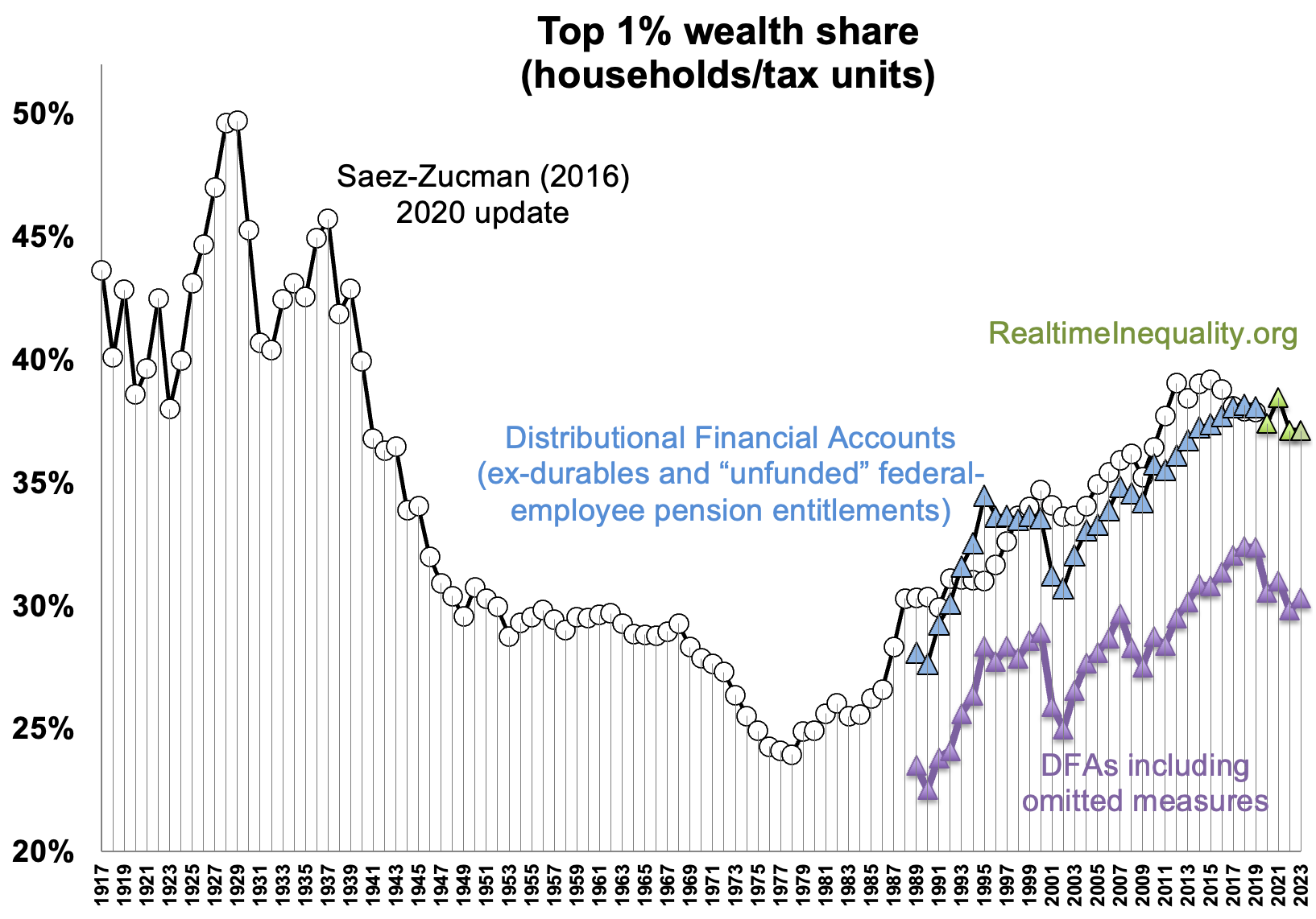
Eyeball-analyzing, wealth concentration (theory #2) appears to be a much stronger driver of The Matthew Effect than the growth of national wealth relative to national income.
As always, comments, suggestions, and especially critiques are very welcome from my gentle readers.
“I use the words ‘capital’ and ‘wealth’ interchangeably.” Capital, p. 47 Full kudos to him for stating this assumption explicitly; it’s baked into many economic theories and their implementations — notably Solow-style growth models — but it’s ~universally left unstated, silent, and hidden.
For comparison, The BLS “labor share of nonfarm business output” measure averages 59% over the period. The Penn World Tables’ U.S. labor share of GDP averages 60%.
This graph and the labor share graph at top are made possible by the Total Household Income Accounts, or THIAs.
This graph is adapted from Saez and Zucman’s gabriel-zucman.eu/files/SaezZucman2020JEPData.xlsx (thanks to Gabriel for his help). It’s updated through 2023 using data from their realtimeinequality.org site.
Interesting breakdown. What if the stronger driver isn’t the concentration or the growth rate of wealth, but the mechanics of how asset markets price in future rents? That angle might complicate the picture. I'll leave that hanging for now